Saturday 29 September 2018

TIPOGRAFÍA MÉXICO — The Future is Female

TMX es la primer conferencia internacional en México, dedicada a la Tipografia, Diseño, y Nuevas Tecnologias. El tema de este año es: THE FUTURE IS FEMALE

TMX is the first international conference in México dedicated to typography, design and new technologies, and the first big typography conference wholly dedicated to female designers!


Image result for TMX—Tipografía México


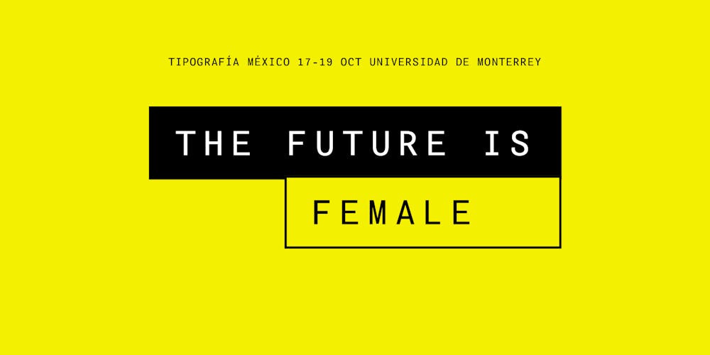
TMX Tipografía México: es la primer Conferencia Internacional en México dedicada a la Tipografía, Lettering, Diseño, y Tecnología.

En esta edición “The Future is Female” descibrirán el potencial del movimiento tipográfico liderado por mujeres mexicanas con proyección Internacional.

Nuevos talentos Mexicanos haciendo Tipografía. Líderes internacionales compartiendo y educando a nuestra comunidad.

SINDY ETHEL (MX)
ROMINA HERNÁNDEZ (MX)
VICTORIA RUSHTON (US)
HANNELORE OCAMPO (MX)
MÓNICA MUNGUÍA (MX)
SANDRA GARCÍA (COL)
DAFNE MARTÍNEZ (MX)


CALL FOR PRESENTATIONS:

LLAMADO A PRESENTACIONES: El comité de TMX Tipografía México los invita a proponer presentaciones de su trabajo en las áreas de Diseño, Lettering, Tipografía, Editorial, Web y Apps.

Manden su propuesta a hola@tipografiamexico.com para que el comité la evalue y puedan compartir su experiencia nuestros invitados. Los requisitos son:

—Nombre y perfil profesional completo
—Sitio Web / Portafolio
—Título de Presentación y Valor de Diseño propuesto
—PDF con selección de 4 proyectos relevantes en las áreas mencionadas
—Fecha límite es 30 de Septiembre de 2018

http://tipografiamexico.com/

Wednesday 26 September 2018

Women of the Bauhaus


Alice Twemlow writes on women of the Bauhaus: ‘Disproportionate, unfortunately, is the way in which the work of the male artists and designers who taught and studied at the Bauhaus have been celebrated over their female counterparts.’

Read the rest of the article here:

Thursday 13 September 2018

Women in Type – A social history

Women’s pivotal role in the development of type design is little known. Prof. Fiona Ross and team aim to change this, with an in-depth study of women in type-drawing offices, 1910–90.

Great reading list at https://research.reading.ac.uk/women-in-type/reading-list/ 


Sunday 9 September 2018

How will we queer design education without compromise?

As educators, the design canon is often the foundation of our practices, but it is inherently reliant on impenetrable binaries. What would a queering of design education look like? What would a pedagogical approach that emphasizes asking questions instead of problem solving consist of? How can we understand designers as bodies in space, with agency, instead of simply “creatives”? And how can we understand bodies of text as living things that produce difficult conversations, instead of simply “content”? In the age of capitalist innovation and professionalization, our focus cannot only be about best practices, creativity, and collaboration. A queering of design education is an opening, an unclosable gap. We must critique our own critiques. We must embrace a multiplicity of perspectives. We must reimagine the past in service of the future. We must cannibalize the canon. We don’t know what these structures might look like and they too will change, but we must go into the unknown, together.

Soundboard features an array of perspectives on pressing issues of our time by figures inside the arts and out—in one interface:

We Can Listen and Push Back at the Same Time, by Kristina Ketola Bore

Let's Talk About Body Reproduction, by Nate Pyper

We Must Make Queer Praxis Accessible, by Ginger Brooks Takahashi

We Must Topple the Tropes, Cripple the Canon, by Ramon Tejada

Feminism Takes Form


By Kristina Ketola Bore

Design has always held the potential to communicate feminist values. Through the transition from a messenger to a creator of content, designers now have more possibility to shape these values than ever before. 

Read the text here: http://www.contemporaryartstavanger.no/feminismen-tar-form/ (Norwegian language first, scroll down for English)


“Kristina Ketola Bore is a design critic, curator, and educator based in Oslo, Norway. She is a co-founder of the platform, The Ventriloquist Summerschool, a subeditor of the art journal Periskop, and lectures internationally at universities and cultural institutions. Her work investigates the social structures within and outside of design, in addition to participation and the role intersectionality and feminisms can play in the design field. These perspectives are also deployed in the act of curation, which has resulted in series of educational art programming for both youth and adults.”

(source: https://walkerart.org/magazine/authors/kristina-ketola-bore)

Sunday 2 September 2018

Jihee Lee — intersectional diagram to represent racism and discrimination in daily life against Asians and people of color

Jihee Lee is a Korean graphic designer who studied and works in Germany. She worked on the normalization of stereotypes and racism, in everyday life, but also in visual culture. For instance on the famous website dafont, with categories such as Foreign Look and subcategory Chinese, Jpn which represent a very stereotyped, Western, view of Asian fonts and culture.

Together with So Jin Park, she created I AM ANGRY!, a website and design project which alerts to the racism and discrimination in daily life against Asians and people of color.

https://eyeondesign.aiga.org/wp-content/uploads/2017/11/iamangry_Jihee_Sojin4.jpg
Intersectional diagram, I AM ANGRY!, 2016


https://eyeondesign.aiga.org/wp-content/uploads/2017/11/Somewhere_in_Between_JiheeLee10.jpg
Stereotypography, in Somewhere in Between, 2016


Read the article on Jihee Lee’s work on AIGA Eye on Design: https://eyeondesign.aiga.org/how-jihee-lee-breaks-down-the-cultural-boundaries-built-by-stereotypes/